

The Ubiquity of Queues
Queues are one of the most common components used to organize. Everything from software processes, tasks, to people need to "Get in line". Does it have a higher priority? You might be at the front of the line. No matter what the queue strategy we have them everywhere.
Visualizing Queues Today
We don't often associate data visualization with queues specifically. We just have common tools that we occasionally apply. Most commonly it's not a visualization at all it's a data table that can be filtered and sorted. Occasionally we see a line chart for queue length over time. Both of these make sense for certain use cases but have limitations in scale and context that are rarely solved.
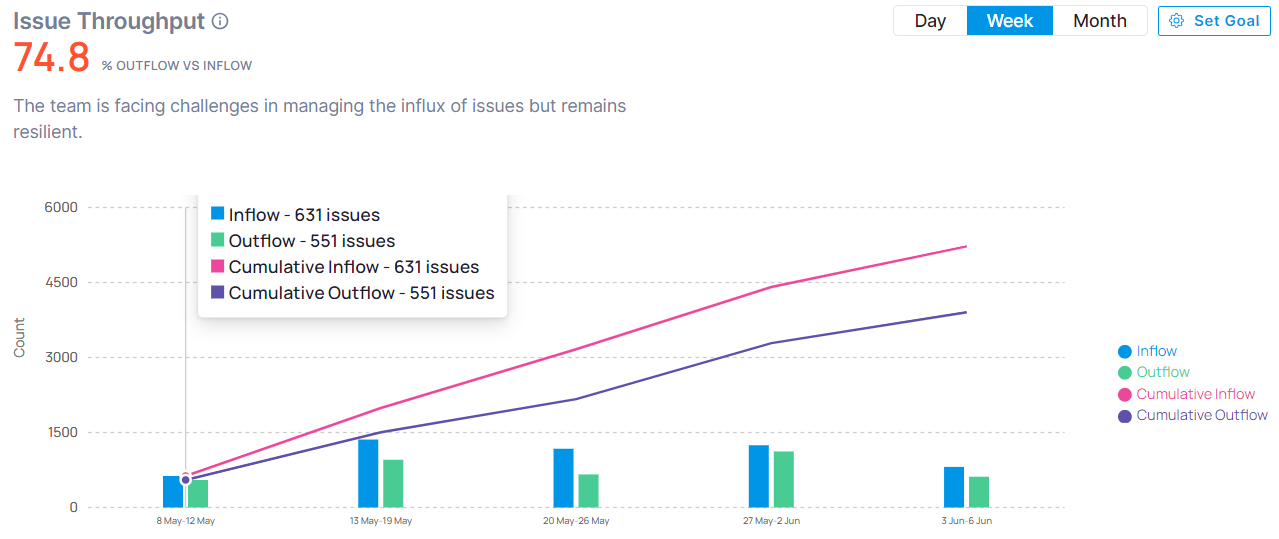
Throughput combination chart
This is a decent high level view to understand the overall progress of queue. Are more items coming in than going out. I wouldn't change this chart for what it does. It's intuitive and serves a common purpose. The only improvements would be from allowing drill downs into anything more specific to understand what's stuck, what came in and why
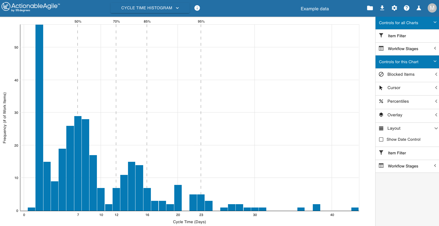
Cycle time Histogram (bar chart)
I'm not a fan of this one. There isn't much here to make decisions from. There's no way to know why. You have to ingest and correlate a lot of various views to get the context you need.
Heatmap Grid
I'm really impressed that this team created separate data visualizations specifically for Queues. It's intuitive and data dense. You can understand the queue volume from a high level in a small area allowing you to correlate with other visualizations
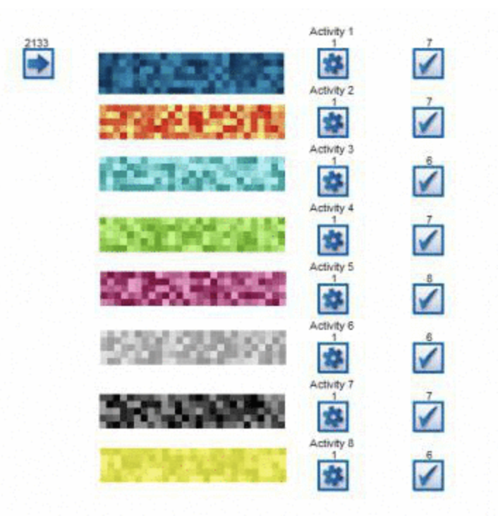
Credit: Simul8 Queue Visualization
Context is Key
A universal solution isn't a very good one: I had a dream of creating the most amazing universal queue visualization for all use cases, and I quickly woke up. I talked to a lot of people I respect and did some research only to realize the obvious: Everyone needs to get something different from a queue depending on their role and what's in the queue. This led me to focus on what I know, software engineering and managing development tasks. There are definitely areas of overlap between what I came up with specifically for development tasks, but I had to start somewhere on a real world application.
Different "simple" perspectives: This was my second realization. That every role has a simple view that they care about, but many of them are different. A product manager will typically need to see an overall value to effort matrix, but a customer service manager will focus on customer value and feature specific timelines. Each focus in an organization has different perspectives and at the top level they all need to be considered, correlated, prioritized and resolved onto an inclusive plan. This view across multiple perspectives that can be compared requires a normalization of what's used across them.
Now I start to understand the challenge: This always seemed like it was totally solvable before. "Why don't they just..." But now I get it. I want to manage by dashboard. Have a dashboard that feels like command and control for understanding and making decisions. A common dashboard for everyone to sync on that helps drive meetings objectively and more efficiently. The first problem is that what we need to measure and chart everything is not currently being measured. So bringing my visualization ambitions into reality will take some more work, but I'll get to that in another post. For the rest of this post we will assume that all of the items in the queue have properties necessary for the decisions everyone needs.
Under, Over or between
In my interviews and research a pattern emerged. People often were looking for what is above or below a threshold.
- Is it ready?
- Are customers asking for it?
- Is it within our guidelines and capabilities?
- Will this result in a sale?
All of these binary questions can be assessed by having a linear rating system for each question, and putting everything on 1 side of it or the other. Is it above or below the threshold?
Sometimes you care about at least 3 groups:
- Below the minimum
- Above the maximum
- In between min and max thresholds
These are still linear, 1d. They are useful for singular views but when you have multiples of them to answer it can be difficult to correlate with each other and understand what the overlapping items are.
Correlating 2 thresholds
Things get a little more interesting when we look to correlate 2 thresholds. First, a couple of ground rules
- Everything correlated must use the same scale. I'm using 0-1 with double precision.
- 0 must = bad and 1 = good across everything correlated.
- The X (first) threshold is more valuable than Y threshold.
If we chart the intersection of 2 thresholds each with only 2 groups I've now re-invented a quadrant chart or 2x2 matrix. It's somewhat validating that I reach a common reference point that everyone understands but this is not very exciting is it? But wait a minute. Why don't we use a "magic quadrant" style chart for queues and thresholds? I found a couple possible explanations:
- Scalability: You end up with clusters of unreadable items in similar locations beyond a certain scale.
- Data Density: Borrowing a bit from Edward Tufte a bit on this thought (I took his course and it influenced me since) We end up with a lot of dead space in magic quadrant charts where there are no items. This is fine as a standalone chart, but it make it difficult to correlate with other charts and information.
I developed my own matrix component to deal with these issues.
Items aren't clustered, they never overlap. They are placed in a group grid so they can be seen distinctly. What matters most is where they are by the thresholds, the details within can be seen in a drill down. This way you can easily tell the group sizes and proportions as well. I call each threshold combo an Item Group
Item Groups have a minimal size, if empty there's just enough to show it's there an empty otherwise it dynamically sizes based on the other groups, this removes all of the dead space that isn't very helpful.
This new dynamically sizing matrix needs to work with threshold combinations where either X threshold or Y threshold can be defined with 2 or 3 groups, giving us 2x2, 3x3, 3x2, and 2x3 matrices.
Now this is starting to feel like something tailor suited to the issues.
Scaling to the nth Dimension
This matrix method will only give us combinations of 2 thresholds at a time. Nothing is that simple. I tried adding a 3rd threshold in a 3rd dimension but it was pretty difficult to view.
What I ended up doing was to create layers of these matrices for the various view and a way to view them in aggregate. This starts to appear as a useful way to manage the complexity. The overall aggregate view follows the same rules as the rest in terms of how you read it, but now it represents as many layers of matrices as you want to define and select.
Conclusion
This has taken way too long to come to a simple and flexible solution. I'll discuss more of my practical application of it in other posts. This one is intended to be purely from a data visualization challenge perspective. I developed my components to be more flexible than necessary so I might use them with other queues. If you are interested in applying custom visualizations to your queues feel free to reach out.